

WealthyEzy
An ultimate wealth management SAAS application for maintain bank accounts, credit/debit cards, overview transaction history, manage investments, and trade stocks.
MY ROLE
Research, IA, UX / UI, App Design, Web Design, Iconography
PLATFORM
Mobile App, SAAS Web Application
TIMELINE
Jul - Sep 2020
01
The
Beginning
The Beginning
WealthEzy is an conceptual wealth management solution aimed to be an super app that solve all the problem faced by the high net worth individuals, stock agents, stock holders, investment firms, casual citizens etc.,
The biggest challenges faced by the users are using a tons of third-party off-the-shelf solution for portfolio management, asset management, bank account management, and payment system. This meant handling wasting valuable time switching between apps and hassle in maintaining everything manually. Beside there is an incapability to enhance the software to the user’s tailored feature set to fine-tune custom portfolios, stock data & wealth management.

As a saas application that needed to fit users of various wealth backgrounds and with dozens of compelling niches, my first step was to do some basic market research to accumulate the end user mental model and create an empathy map from user stand point.
Based on the research and using the job to be done approach I started preparing the user interview questions. Once done, I started writing the user stories starting off with epic and breaked them into product backlogs to give a clear picture of every single end user. User personas were created and key understandings were derived.
02
Understanding
and Focus Point
Understanding
and Focus Point
User Interview
Empathy map
User Personas
Micheal Samson, 38
Investor
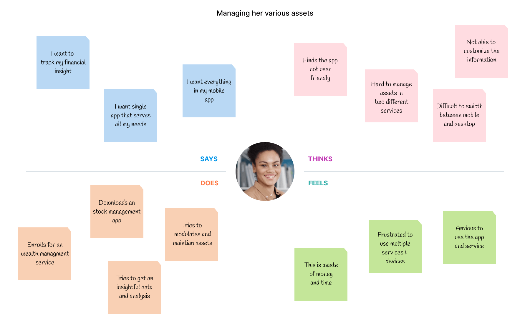
PAIN POINTS
- Hard to find one application that serves all my financial maintainence needs.
- No customizable features were provided.
- Not able to see money in bank, how stock perform and maintain portfolio.
GOALS
- Platform must be as simple and intelligible.
- Find information that is needed in glance and perform actions in-app.
Susanne Bailey, 22
CEO
PAIN POINTS
- Tough to get the financial insight and trade analysis.
- Lack of mobile app that give the same desktop experience.
- Bombarded with tons of useless information making it tough to use.
GOALS
- Have a appealing & customizable application with useful insights.
- Nice to have a mobile app that gives same experience.
Key Understandings

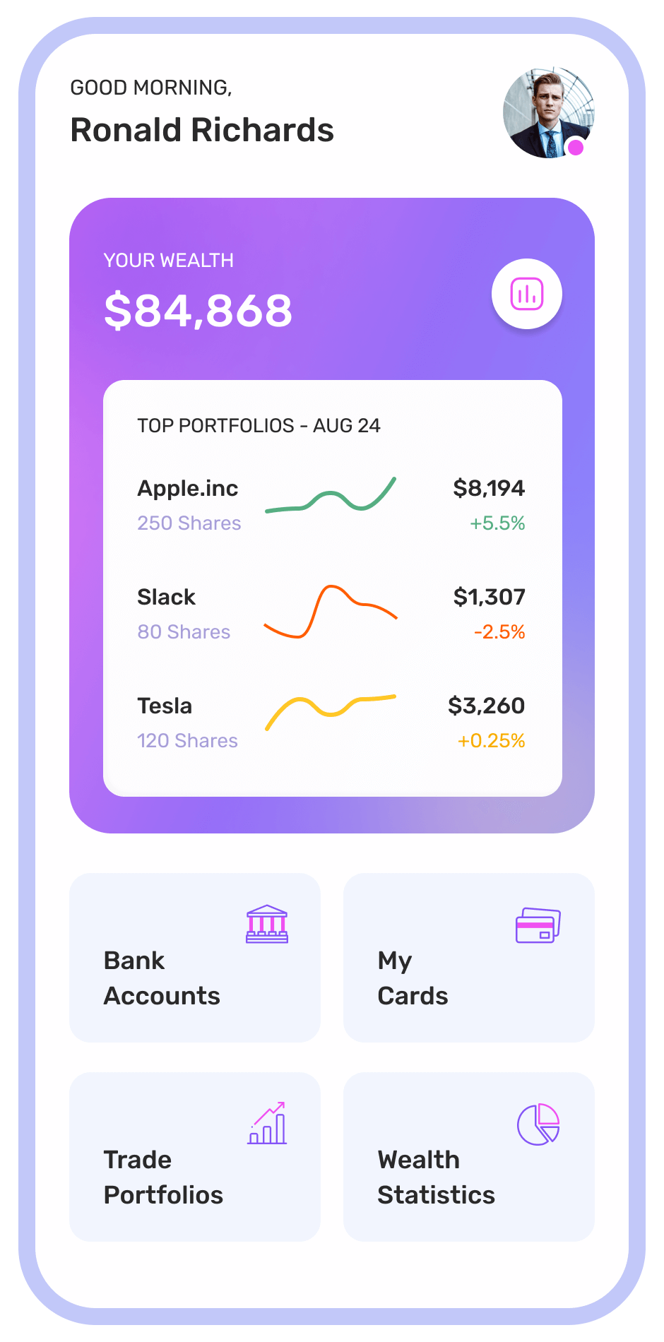
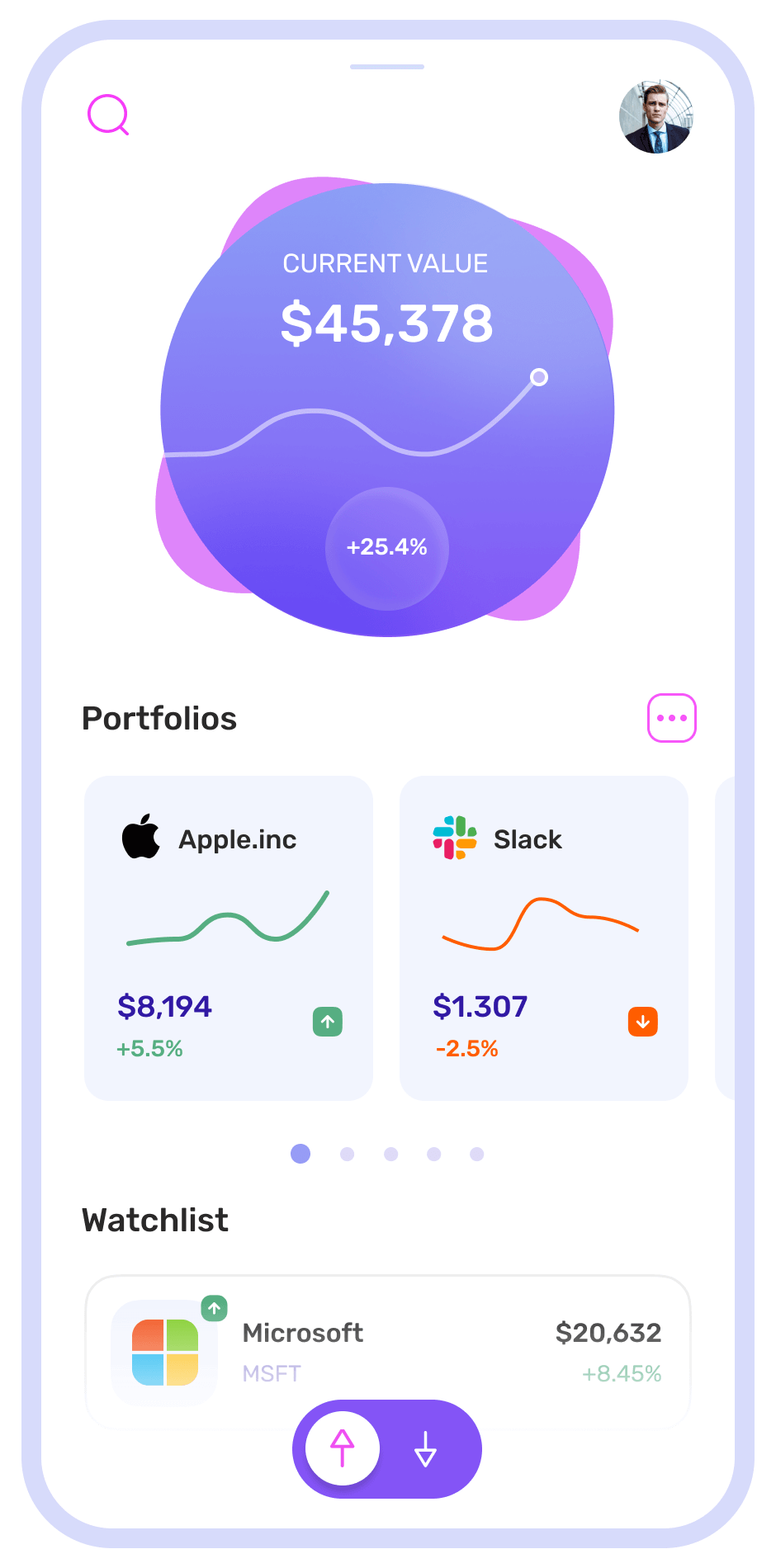
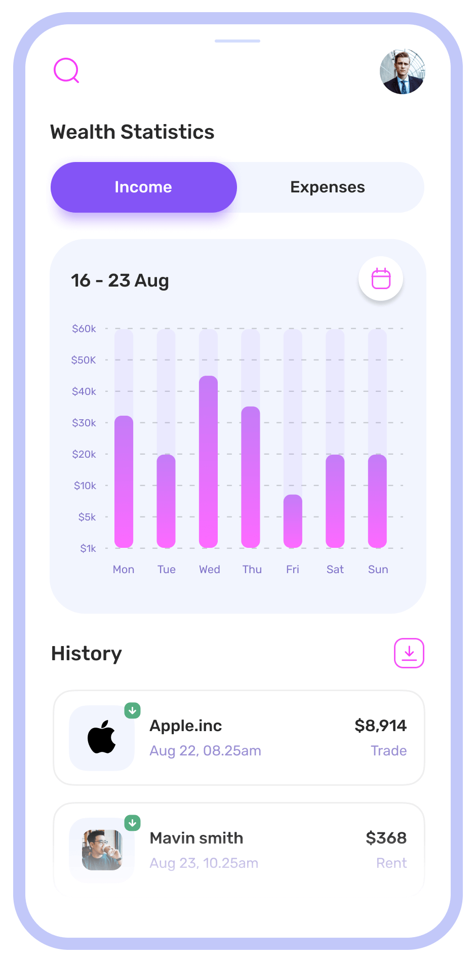
Design a application that provides statistical data that displays more information on the user's financial status & overall asset values in an aesthetically appealing way.
Ideate and structure out the layouts to be indepedent blocks which can be arranged and re-arranged based on the user liking.
Design an mobile app that equal the usability experience levels provided by the web/sass application & visualise the data for a quick glance & action.
Making the app easy to use by reduding the cognitive load by minimizing the colors and boosting lot of negative spaces.
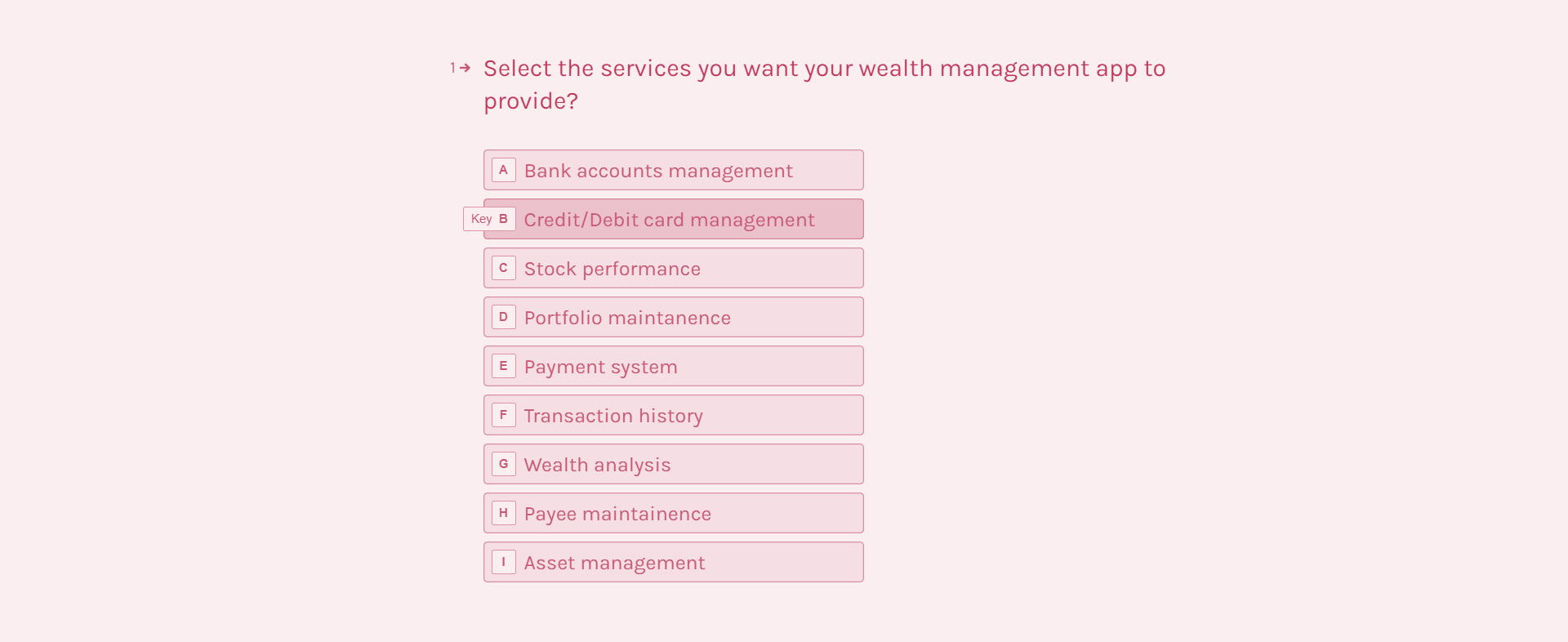
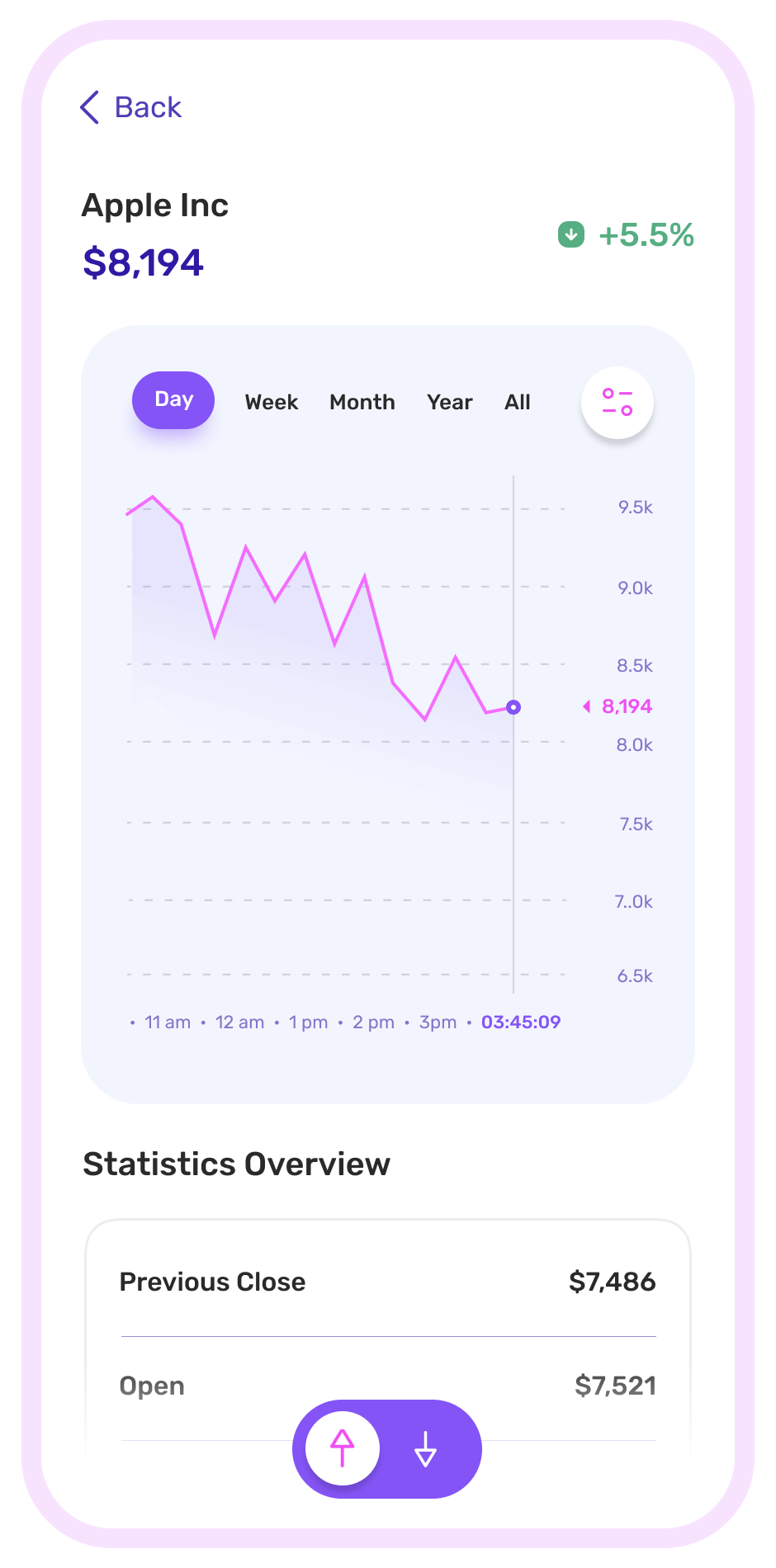
Provide an detailed real-time stock value monitoring system which user can control based on their portfolio and personalised watchlist.
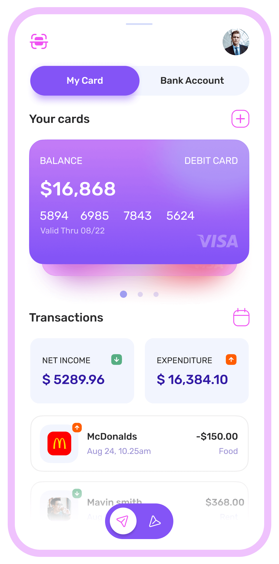
Give an clear and detailed statistics presenting the income/expense data, with ease to access transaction history.
03
Ideation
and User Flow
Ideation
and User Flow
As the key understandings were derived, I tested out the points through set of paper prototypes to understand the further CX problems. Based on the results I started working on the user flow models and customer journey maps to further get an insight on the user process thinking and decision making.
Also I held back to look into the visual design from psychology point of view and defining the colors, typefaces, dimensions and patterns for the platform.
Color and Typography
MEDIUM PURPLE
A symbol of calmness and wisdom. It exudes sense of royality and enlightenment.
NEON PINK
A symbol of excitement and warmth. It gives the sense of safety and calmness.
PASTEL BLUE
A symbol of wholeness and clarity. Color that promotes trust and intuition.

Then I focused on creating a concise visual hierarchy with all the data and understandings. I updated the information architecture to suit the three basic user flows. I got into sketch to create lo-fi wireframes to describe the flow of the platform and the logical structure of the elements that defined the features of the application.
Once the wireframes were ready they were strategically tested with users using hybrid usability tested and eye tracking heatmaps and required iterations were made.
04
Wireframe
and Prototype
Wireframe
and Prototype
05
Final
Design
Final
Design
Once the wireframes were tested and couple of iterations made, I got back to sketch to create the final high fidelity prototypes. Then I evaluated the designs to find any usability flaws (luckily none) and set out some benchmark testing to compare the Ux, Ix and Cx of the design. The final end-user feedback were positive with having solved the important pain points.
Dashboard Screen (Web App)

Dashboard Screen
Workout Screen
Workout List Screen
Program Detail Screen
Pro Screen
Statistics Screen
